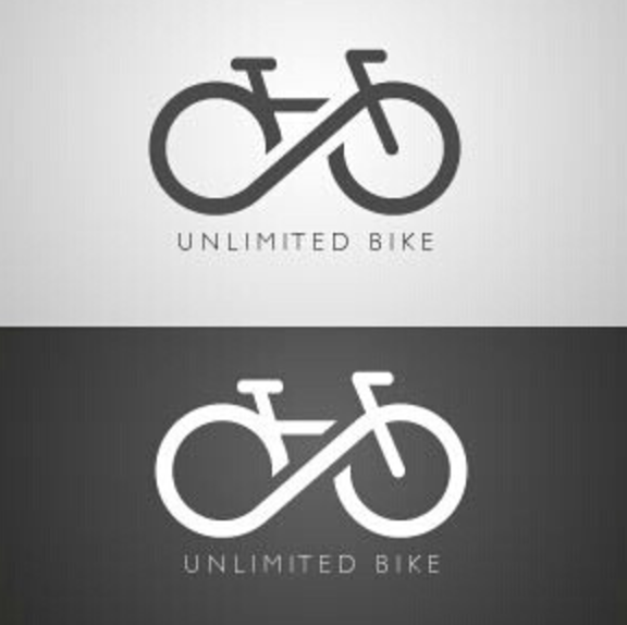
This is a logo for a cycling brand that I thought illuminated a lot of what we learn in design classes. The typeface is simple, but effective, and the logo itself is very simple. There isn’t too much complexity that complicates the message. Also, the “Unlimited” is shown very cleverly through the subtle, yet impactful infinity symbolism. The contrast of the dark charcoal grey with the white also looks sharp, and would portray nicely on business cards and other sorts of stationary items. Obviously isn’t the best quality photo, but you get the idea.
The link to the picture online is here. https://www.pinterest.ca/pin/16395986124335719/


I pretty like this logo, it communicate very well even through the logo is simple. The symbol of unlimited combine the image of bike together by transforming into the wheels of bike that reflect the name of logo. The pure black and white color looks comfortable.
LikeLiked by 1 person