
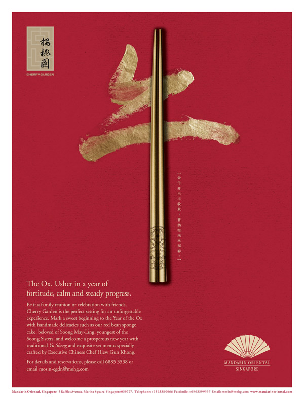
This is a Chinese restaurant poster for the upcoming Ox New Year in Singapore. The poster combined the traditional Chinese calligraphy (Ox in Chinese character) and chopsticks (for food). The use of colors in this poster is culturally appropriate, which use the color of red and gold to represent Chinese New Year. The use of typo in the poster is suitable and fit into the poster.
Link to this poster: http://theartistandhismodel.com/2011/03/cherry-garden-by-trine-design/
(Artists by Trine Design in Singapore).

I also enjoy this poster design from the following aspects:
1. The color is strong enough to attract audiences;
2. The background color is also appropriate because the poster wants to represent the special festival– Chinese New year.
3. The Chinese words which is in the center is combined by two elements– Gold and chopsticks which are also considered as the Chinese element.
Therefore, I believe this poster is designed very well by the limited color, attractive background, and symbolic word.
LikeLike
This poster looks really great. it combines the traditional Chinese words for ox with chopsticks which shows the significant of Chinese food in the culture. The letter ox represented the year of ox according to Chinese tradition. And the whole background red color was often used in many Chinese festivals because it represents fortune, joy and happiness which demonstrate the purpose of the poster is to celebrate and enjoy the Chinese new year.
LikeLike