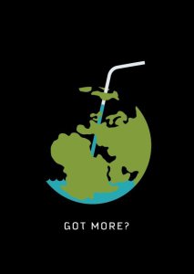
This logo design is super captivating. Right off the bat, with the design of the earth present it already has me thinking of global issues. With the water not filling the entire earth and the simple words at the bottom “got more?”, I automatically think of a campaign of some sort, promoting the preservation of clean water or minimizing pollution.
From a visual standpoint I really like the multi dimensional feel of the earth resembling a cup/drinking glass, with the water on the inside (and going up the straw). The black background also allows for the focus to stay on the logo.
I completely agree. I love the upfront simplicity of the image that helps make the message so much more powerful. Thanks for your in-depth and creative response 🙂
I think the main visual appeal for me comes from the straw and water contrasting what the usual visual would be of water on the surface of the globe. The way the graphic shows the water sitting at the bottom as if the globe was containing it creates an interesting contrast! Sweet design between 2d and 3d elements!


This logo design is super captivating. Right off the bat, with the design of the earth present it already has me thinking of global issues. With the water not filling the entire earth and the simple words at the bottom “got more?”, I automatically think of a campaign of some sort, promoting the preservation of clean water or minimizing pollution.
From a visual standpoint I really like the multi dimensional feel of the earth resembling a cup/drinking glass, with the water on the inside (and going up the straw). The black background also allows for the focus to stay on the logo.
LikeLike
I completely agree. I love the upfront simplicity of the image that helps make the message so much more powerful. Thanks for your in-depth and creative response 🙂
LikeLike
I think the main visual appeal for me comes from the straw and water contrasting what the usual visual would be of water on the surface of the globe. The way the graphic shows the water sitting at the bottom as if the globe was containing it creates an interesting contrast! Sweet design between 2d and 3d elements!
LikeLike